
A driver has only a few seconds to notice your message, understand it, and remember who delivered it. That is what makes effective billboard design tips so valuable: a billboard is not a brochure, a website, or a social post. It is a high-impact message built for motion, distance, and repetition.
The strongest outdoor creative makes one clear promise to the right audience in the right place. Whether you are promoting a local service, building franchise awareness, or supporting a regional campaign across Central Florida, the goal is simple: make your brand impossible to overlook and easy to recall.
Effective Billboard Design Tips for Better Results
1. Start with one business objective
Every billboard should have a job. It may be to introduce a new location, keep your brand top of mind, drive calls, promote a limited-time offer, or reinforce a message people have seen elsewhere. Trying to accomplish all of those things on one board usually weakens the result.
Choose the action or impression that matters most, then build the creative around it. A roofing company might lead with storm repair. A restaurant opening in Davenport might focus on its nearby exit. A healthcare provider may prioritize name recognition and trust over an immediate offer. The right message depends on the campaign goal, the audience, and the location of the display.
2. Write less than you think you need
Billboard copy needs discipline. Drivers cannot pause, reread, or scroll back. If your message takes longer than a few seconds to absorb, most of the audience will miss it.
Aim for a short headline that communicates the main benefit, then support it with your brand name and one clear call to action when appropriate. Instead of listing every service, lead with the one that solves the audience’s most pressing problem. “Same-Day AC Repair” is stronger at highway speed than a dense list of HVAC services, financing options, phone numbers, and credentials.
A small amount of copy can still do major work when the words are specific. Strong outdoor language is direct, benefit-led, and easy to say out loud.
3. Design for viewing distance, not desktop screens
Creative that looks polished on a laptop can fail on a billboard. Small type, thin fonts, subtle contrast, and detailed imagery often disappear when viewed from hundreds of feet away.
Use large, bold lettering with generous spacing. Prioritize high contrast between the message and its background. Dark type on a light field or light type on a dark field will generally outperform combinations that blend together. Before approving artwork, view it at a reduced size or from across a room. If the headline is hard to read there, it will be harder to read from the road.
Type size is not just a design preference. It directly affects whether your investment is understood by real people moving through real traffic.
4. Use one visual that earns attention
A billboard should not feel like a collage. One powerful image, product shot, face, or visual idea gives the audience a fast entry point. Multiple small photos compete with each other and create visual noise.
The best image depends on the category. A close-up of a menu item can work for a restaurant. A recognizable spokesperson can strengthen a professional service brand. A clean product image may be enough for retail. What matters is that the visual supports the message instead of requiring explanation.
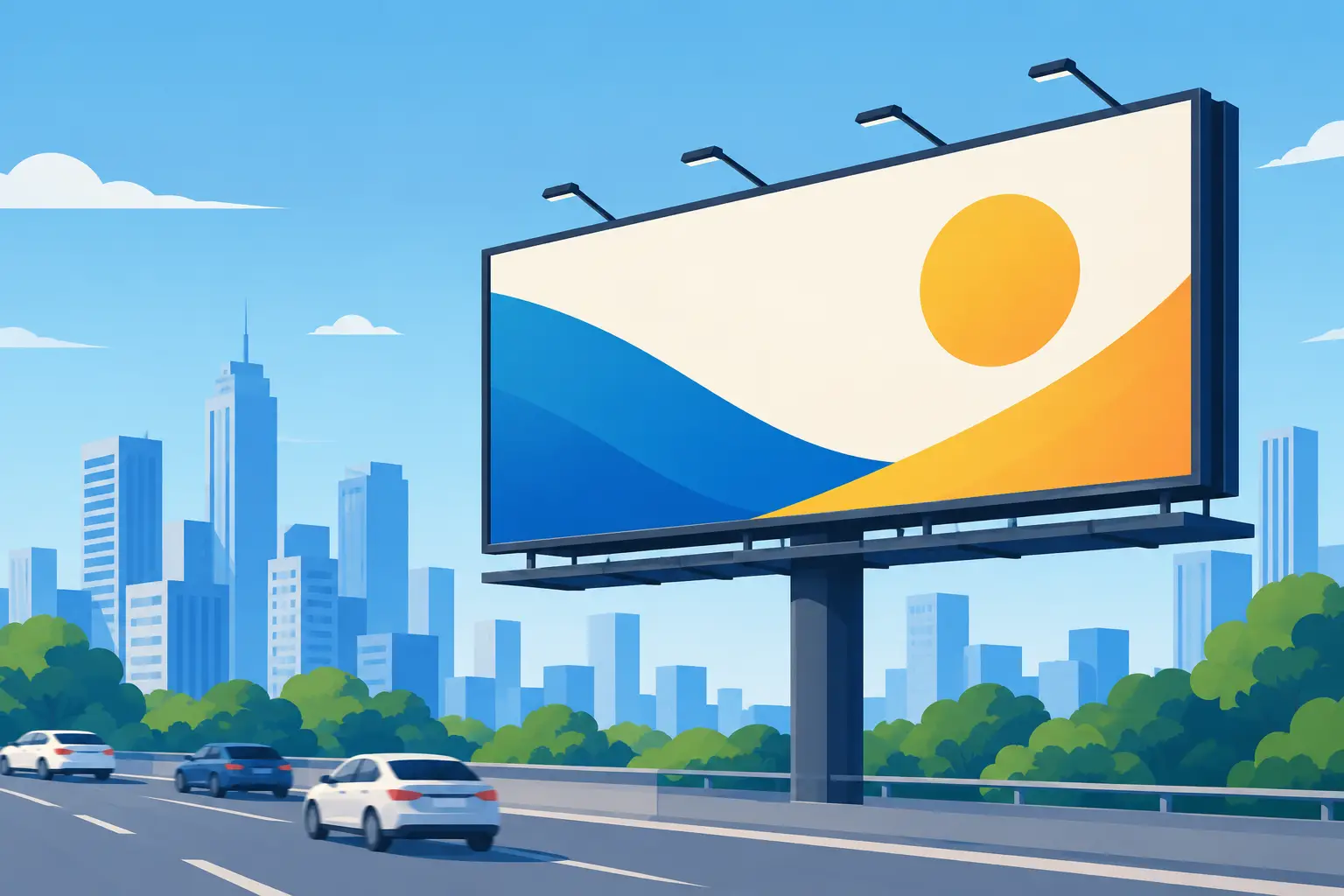
Keep backgrounds simple. A striking color field, a clear skyline, or a single branded element often gives the headline more room to work than a busy scene does.
5. Make your brand recognizable at a glance
Attention is only valuable if viewers connect the message to your business. Your logo, brand colors, and business name should be visible enough to register quickly without taking over the entire design.
For established brands, familiar colors and distinctive visual assets can carry significant recognition even when copy is minimal. For newer businesses, the name may need more prominence so drivers can make the connection. This is one of the biggest trade-offs in billboard design: awareness campaigns can lean into branding, while response-focused campaigns may give more space to an offer or action.
Consistency matters across every touchpoint. When a prospect later sees your search ad, social content, storefront, or website, the campaign should feel immediately connected.
6. Give the audience one next step
Not every billboard needs a call to action, especially when the goal is broad awareness. But if you want people to act, give them one simple direction.
A short URL, memorable phone number, location cue, or concise phrase such as “Visit Us in Winter Haven” can work well. QR codes can be useful in places where people are stopped or moving slowly, but they are not a universal solution. On fast roads, they are difficult and unsafe to scan. In those situations, a memorable website, brand name, or search-friendly phrase is the smarter choice.
Do not ask viewers to call, text, scan, download, follow, and visit all at once. One next step creates less friction and improves recall.
7. Match the creative to the roadway and market
A board near an airport, a tourist corridor, or a daily commuter route reaches people in different mindsets. Message timing, offer relevance, and directional information should reflect how that audience is moving through the area.
For example, a local attraction may benefit from a message that speaks to visitors arriving in Orlando. A service business in Lakeland may want a familiar, trust-building message that reaches residents repeatedly on their daily drive. A location-based cue can be highly effective when the business is close enough for a driver to act on it.
This is why media planning and design should work together. The right creative on the wrong route can underperform, while a clear message placed near the right consumer traffic can create sustained momentum.
8. Build for repetition, not a single impression
Outdoor advertising is a frequency medium. People see strong boards again and again, and that repetition builds familiarity. Your creative does not have to explain everything on the first exposure. It needs to leave a memorable impression that becomes stronger over time.
Use a phrase, color treatment, or visual element that can stay with the audience. A campaign with a consistent message across multiple boards can be especially effective for businesses that need market-wide recognition. Repetition also supports other media by making digital, radio, and social messages feel more familiar when consumers encounter them later.
If a design only works after close inspection, it is relying on a level of attention outdoor media should not demand.
9. Test the board before it goes live
A final proof is your last chance to catch the details that can reduce performance. Check spelling, phone numbers, URLs, offer dates, logo quality, contrast, and legal requirements. Then test the creative from a viewer’s perspective.
Ask someone unfamiliar with the campaign three questions: What business is this? What is the main message? What should you do next? If the answers are not immediate, simplify the design.
It also helps to review the artwork in the context of the actual display format. Static boards, digital boards, wallscapes, and bulletins each have different dimensions and viewing conditions. A design team with outdoor experience can adapt the message to the format rather than forcing a print ad into billboard space.
10. Let experts handle the details that affect impact
Great creative is only one part of an effective campaign. Production quality, installation, location selection, campaign timing, and ongoing coordination all influence how the final message performs.
Orlando Outdoor helps businesses bring those pieces together, from messaging and in-house design to production and placement across Central Florida. That full-service approach keeps the campaign focused on what matters most: reaching the right people repeatedly with a message they can absorb in seconds.
A billboard earns its value when it becomes part of the landscape your customers travel every day. Keep the idea bold, the words few, and the brand unmistakable – then give that message a location and run time worthy of being remembered.